Design (Figma)
CSS stands for Cascading Style Sheets and is used to style and layout web pages.
It allows you to control the color, font, spacing, and overall appearance of your web pages.
In this lesson, we will cover the basics of CSS and how to use it to style web pages.
You can use color names, hexadecimal values, RGB values, and HSL values to specify colors in CSS.
For example, you can use "red", "#ff0000", "rgb(255, 0, 0)",
or "hsl(0, 100%, 50%)" to specify the color red.
We can import a web font from the HTML <head> using a <link> tag.
This is usually faster than using @import in the CSS file, because the browser discovers the font stylesheet earlier.
<link>
<link rel="preconnect" href="https://fonts.googleapis.com">
<link rel="preconnect" href="https://fonts.gstatic.com" crossorigin>
<link href="https://fonts.googleapis.com/css2?family=IBM+Plex+Sans:wght@300;400;500;600;700&display=swap" rel="stylesheet">
@import
@import url('https://fonts.googleapis.com/css2?family=IBM+Plex+Sans:wght@300;400;500;600;700&display=swap');
Then, you can use the font-family property to apply the font to your elements:
  body {
        font-family: 'IBM Plex Sans', sans-serif;
    }
Visit Google Fonts
Observation: @import was used in the CSS file to keep the HTML files simpler.
Margin is the space outside the border of an element, while padding is the space between the content of an element and its border. The border is the line that surrounds the padding and content of an element.
By default, the width and height of an element only include the content, and do not include padding and border.
This can lead to unexpected layout issues when you add padding and borders to an element.
To fix this, you can use the box-sizing: border-box; property, which makes the width and height of an element include the padding and border.
  .box {
        width: 200px;
        padding: 20px;
        border: 5px solid black;
        box-sizing: border-box;
    }
With box-sizing: border-box;, the total width of the element will still be 200px, and the content area will shrink to accommodate the padding and border.
box-sizing: border-box; on all elements to make layout easier and more predictable.
  * {
        box-sizing: border-box;
    }
The display property in CSS is used to specify how an element should be displayed on the page.
Block elements take up the full width of their container and start on a new line. Examples include <div>, <h1>, and <p>.
Inline elements only take up as much width as necessary and do not start on a new line. Examples include <span>, <a>, and <strong>.
Inline-block elements are similar to inline elements, but they can have a width and height. Examples include <img> and <button>.
Flex and grid are layout models that allow you to create complex and responsive layouts. Flexbox is a one-dimensional layout model that arranges items in a row or column, while Grid is a two-dimensional layout model that allows you to create grid-based layouts.
Obs: Flexbox and Grid will be covered in more detail in future lessons.
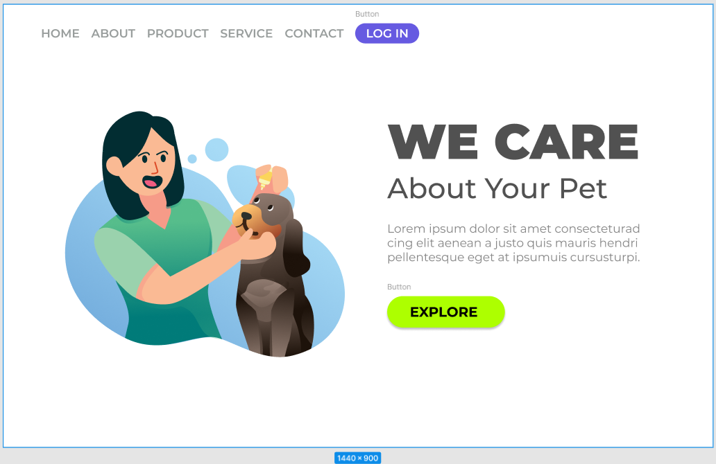
Provided a page from the FIGMA file, replicate it using only HTML and CSS.
Open Project 01
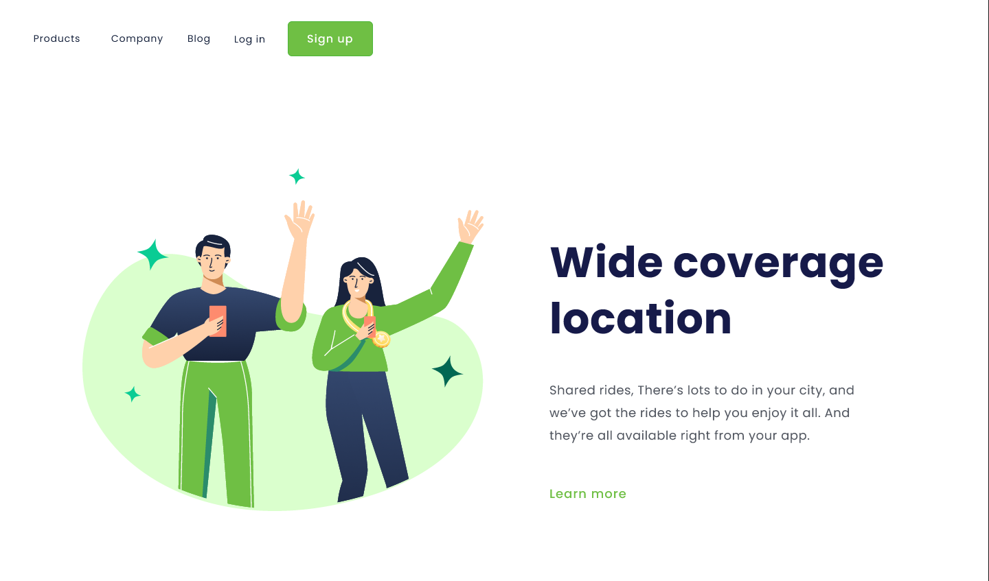
Final Challenge of the CSS_Intro course, and as a bonus, i tried to edit the Logo.svg with AI to animate it, it worked surprisingly well. The index.html and style.css was made by hand, of course.
This is a mirror of the style.css file for demonstration purposes.
var(--color-primary); ,background-image , @media (max-width: 1150px) , :is(ul, ol) li and so on, are features that I remember it exists but wanted to review, even if the lesson doesn't cover them yet/in detail.